Posts tagged guelph bathroom renovator
A Traditional Bathroom Renovation
 

We had to make a quick post about a bathroom renovation we did in Guelph back in February of this year. We got a chance to go back and take some photos recently to show it off. The style is just so different to what we usually encounter and we love all the details, which we are going to share with you. Read on to see what it looked like before and what upgrades were made!

Pssst, click to enlarge any of the photos.


BEFORE

AFTER


Our clients wanted to update everything in their ensuite. We opted for a traditional colour palette and style which ran throughout their home. The vanity was taken out and replaced with a Darby Home Co. 60" vanity with one sink, as they wanted more counter space rather than a double sink and went with the matching mirror as it came as a set. The vanity was solid, well constructed, and of course, in the traditional style. We went with some shaded wallchiere sconces in classic bronze (find it here) on either side for some task lighting. We made sure the bathroom was well lit all around. Bonus, they are all on a dimmer! Did somebody say mood lighting. 


BEFORE

AFTER

AFTER


The biggest upgrade by far was the shower. The bath tub was taken out completely to make room for a large barrier-free walk-in shower with natural stone tiles, fitted with Hansgrohe fixtures in oil rubbed bronze as well as a linear drain. Our clients wanted some privacy whilst taking a shower, and to deliver that we built a half wall and installed custom glass around the enclosure. 


BEFORE

AFTER

AFTER


Okay, so we took the bathtub out. what took its place? Just an open area where you can enjoy a seat on the bench if you want to, or look at art while the heated floors warm up your feet. The nice thing about the heated floors that we installed is that you can program it to turn on whenever you like. So, lets say you program it to start during winter mornings just before you step into the bathroom... so when you do get in there you just say "ah, warmth." This area also beautifully displays the wainscotting we put around the room as well.

Want to know more? Ask below! Want us to give you some ideas on how to upgrade your bathroom? Get in touch here, and shoot us a message. Also, don't forget to let us know what you think of this transformation. Is this your style?


All photos taken by Mikro Renovations

Get The Look: Mid Century Modern

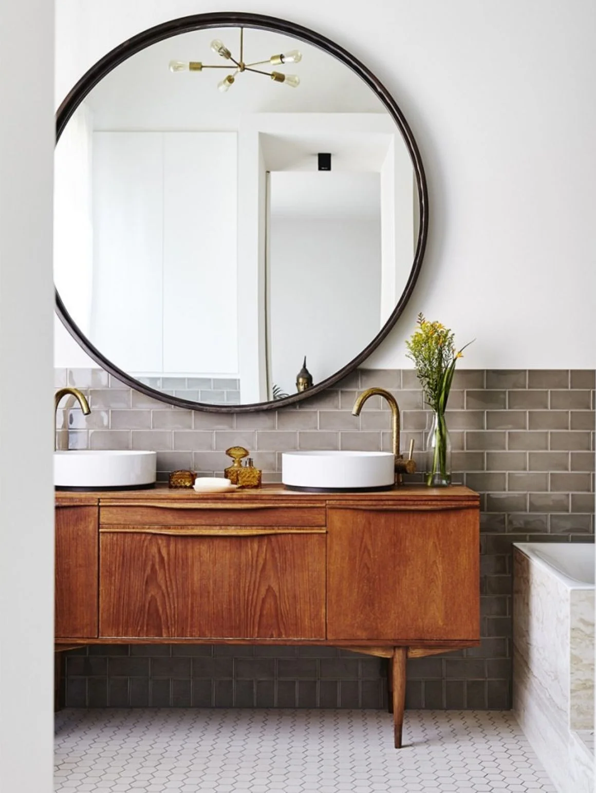
The layering of mid-century furniture with modern design details creates an intriguing, intentional space that balances old and new. Mid-century modern inspiration draws from the mid 1930s through the 1960s, a span when design was sleek, elegant and functional, contributing to it's enduring popularity and appeal to today's homeowners.  Read on for tips on how to achieve the look in your bathroom and one way we would put together a Mid-century modern bathroom.


Key Elements
 

(Image credit: Marc Heldens)

(Image credit: Marc Heldens)

1. CLEAN LINES & FUNCTIONALITY

Furniture from this era is characterized by an understated look. Clean lines, curves, and smooth surfaces. It's about geometric minimalism. It plays up the natural beauty of the design with little fuss. Design is usually far from being heavily embellished or ornate. Instead, it is light and airy, boasting neat proportions and functionality. Form definitely follows function in this style.

2. WOOD DETAIL

If there is one type of design that puts a spotlight on wood, it's mid-century modern. Wood detail is the unifying element. 

(Image credit: Damon Liss Design)

(Image credit: Damon Liss Design)

3.LAYERING TEXTURE & COLOUR

Mid-century modern design showcases quality pieces of furniture or accessories rather than decor on the walls. White or neutral colour palettes are typical on the walls, but your space comes to life with accessories, bright colours, various patterns and textures. In a bathroom this can mean mixing fixture finishes, decorative tiles, towels and rugs.

4. MIX MATERIALS & FINISHES

One of the hallmarks of Mid-century modern design is freely mixing materials. The post-war surge of new materials meant the exploration of combining different and contrasting materials. The old adage that you can't mix metals is totally out the window. Get creative and combine different materials like classic wood with a beautiful quartz or marble top. Have fun with it. 

5. BOLD & INTERESTING LIGHTING

Lighting usually resembles abstract art pieces adding drama and interest to the room. Think sputnik style lighting with unpolished steel and brass metal work, classic of 1960s mid century modern style. Geometric shapes, globes, hourglass and rings were the dominant shapes. 

In the end design is all down to personal preference. Sometimes you may just want a touch of the style style, while sometimes you want to go all out and truly vintage. 


GET THE LOOK

Mid Century Modern Bathroom.001.jpeg

1 / 2 / 3 / 4 / 5 / 6 / 7 / 8 / 9 / 10 / 11 / 12 / 13 / 14 / 15


Here is one way we would style a Mid-century modern bathroom with a neutral colour palette and just a dash of blue. Click on the each number to know more about each product. Want to know how we would finish off this design or want us to personalize a design just for you? Shoot us a message and let's chat.