Posts tagged guelph bathroom remodeller
Styling a Console Sink

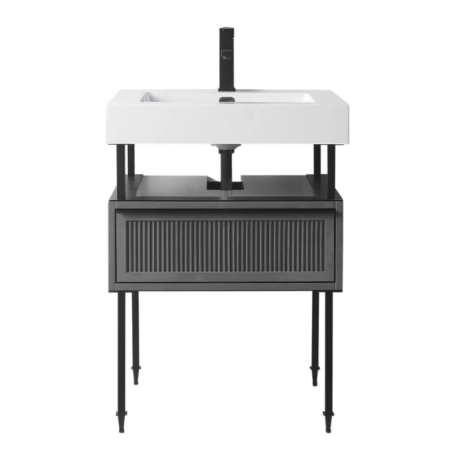
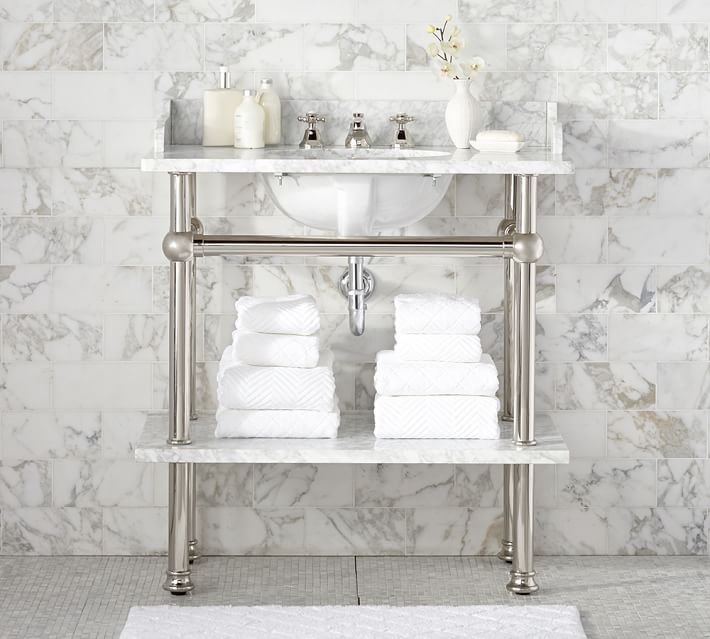
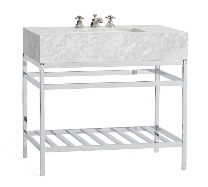
We love incorporating unique details in a bathroom whether that be lighting, cabinetry, decor, faucets…you name it, but today we’re going to be talking about sinks, particularly the console sink. Console sinks don’t really offer a whole lot, they are not too practical as there isn’t a lot of built-in storage and often times aging the bathroom way way back, but I’ll let you in on a secret… when you don’t really need that much storage (like in a powder room) and when it’s styled just right the console sink gives the room so much character! I’m here to show you how to style a modern bathroom with vintage flair using the console sink.

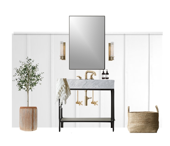
There are many ways you can style a console sink by incorporating different design elements to achieve a collected look. Here’s one way we would go about styling a console sink with signature style. A touch of vintage, some classic elements, modern lines, and soft natural textures.


GET THE LOOK

  1. Console Sink // Restoration Hardware

  2. Sink Faucet // Brizo

  3. Hot-cold supply line // Rejuvenation

  4. Mirror // CB2

  5. Sconces // Brayden Studio

  6. Jute Basket // Restoration Hardware

  7. Ribbed Metal Planter // McGee and Co.

  8. Turkish Hand Towel // June Home Supply


For this combo, we mixed metals and went with matte black and brass finishes, adding an eclectic element. We selected a console sink from restoration hardware with a timeless marble top, and put it against a classic board and batten wall to add texture to the room. We tone down the room to a more casual vibe with through decor with the jute basket, turkish hand towel, and ribbed metal planter. Simple, casual, modern, yet timeless!

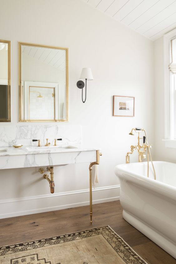
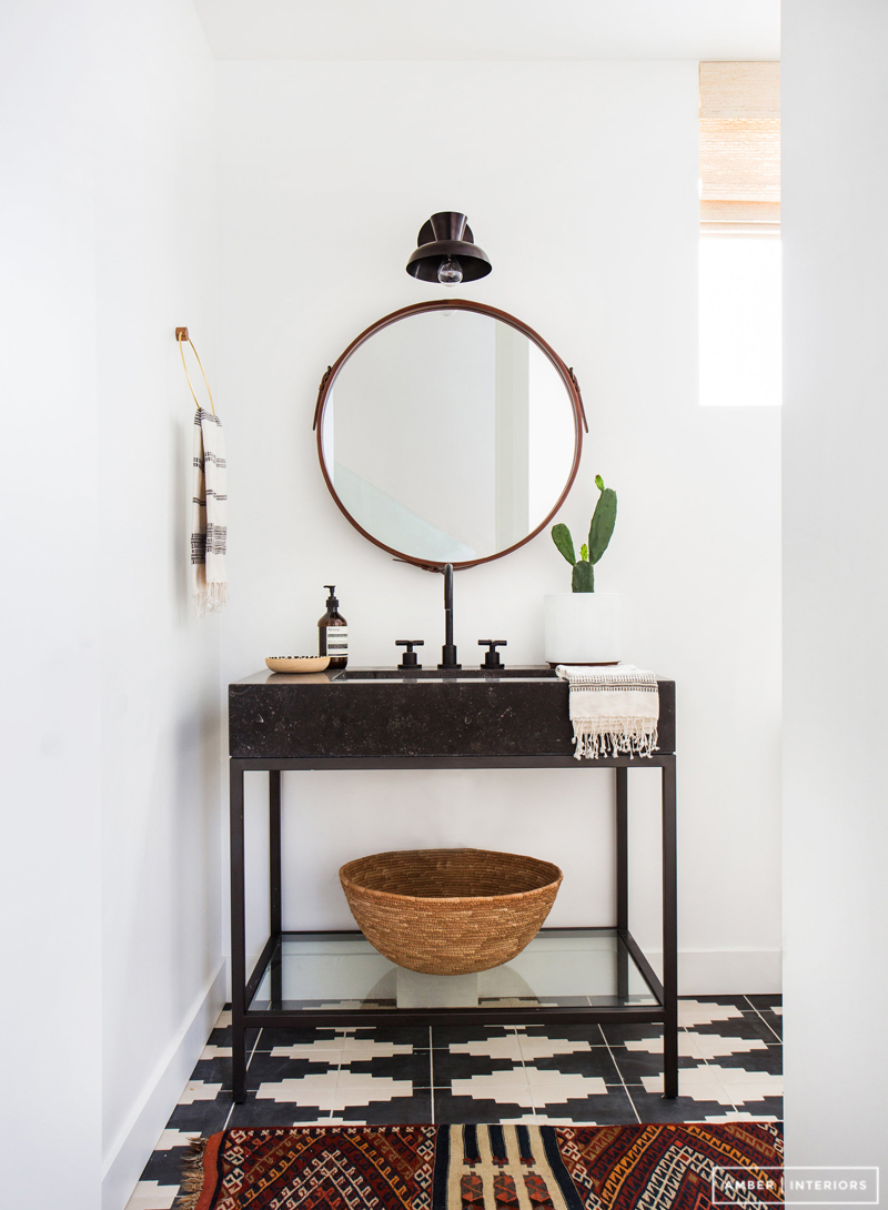
But don’t just take inspiration from us, here are some other designers who have done it oh so right. Simply swoon worthy!

 
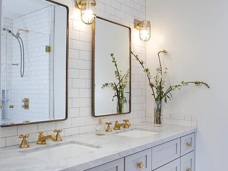
Design by Katie Martinez

Design by Katie Martinez

Design by Decus Interiors
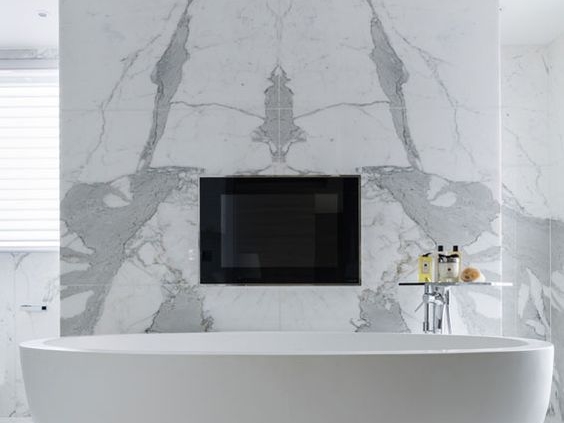
Design by Decus Interiors
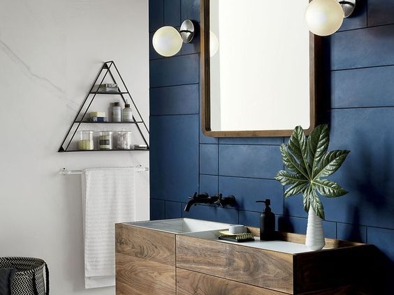


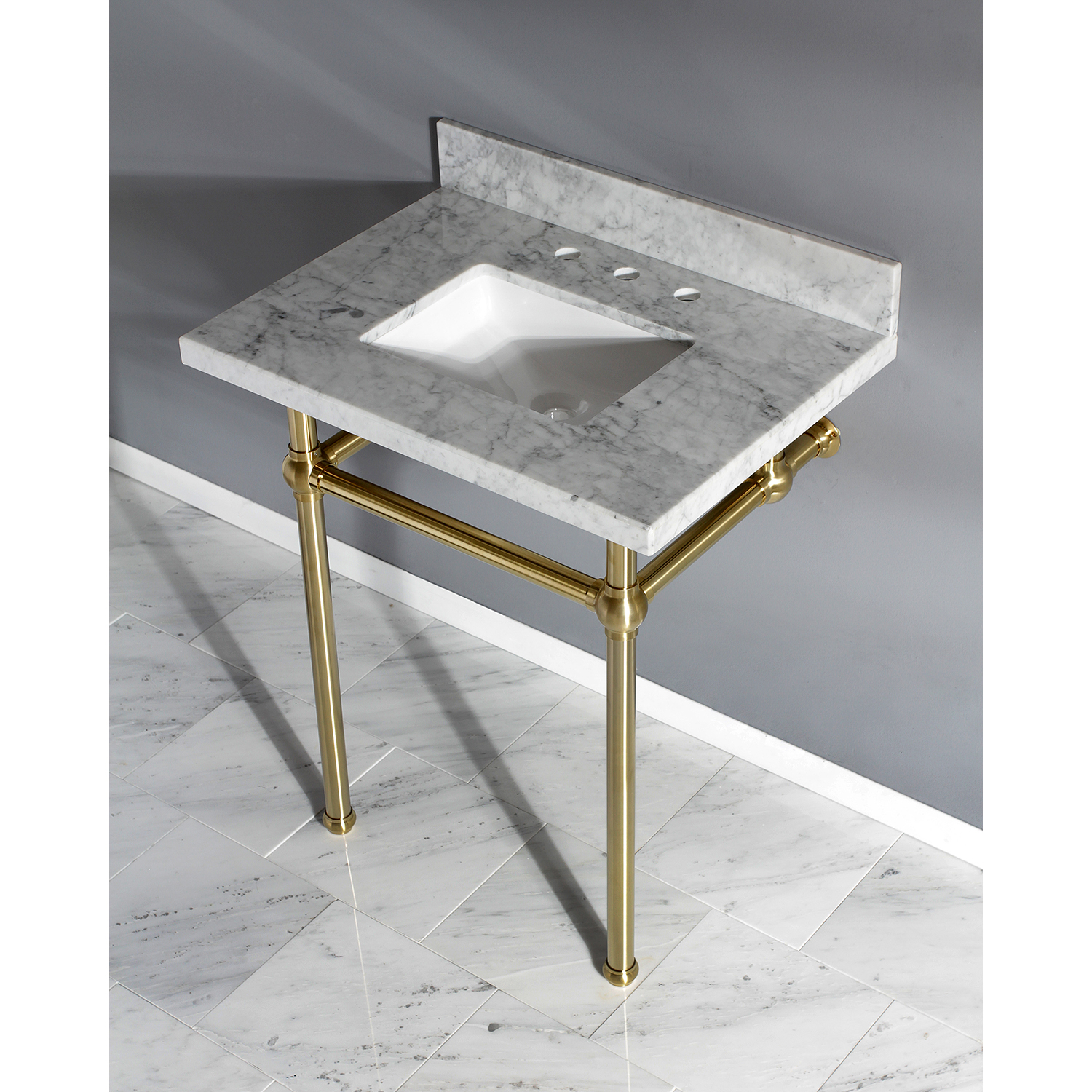
Shop our favorite Console Sinks

Farmhouse Finds: Vanities


We’re starting a new series on our blog called “Farmhouse Finds,” each post will consist of a round up of items in a different fixture or decor categories to help you design a bathroom with a modern farmhouse feel. With the modern farmhouse design gaining traction in suburban areas, thanks to HGTV shows like Chip and Joanna’s, “Fixer Upper”, we want to help you navigate the web to help you find farmhouse gems for your bathroom renovation. In today’s post we round-up twelve farmhouse vanities we are currently loving from Wayfair. Click on the links to find out more about these fabulous vanities


Guelph farmhouse bathroom renovation vanity
 
Get A Grip On Grout: How To Pick The Right Colour
 
(Image credit: Derek Swalwell)

(Image credit: Derek Swalwell)


Oh, grout....often an afterthought in a bathroom renovation for many homeowners. With so many decisions to be made, the colour of the space between tiles barely seems like a significant design element, but au contraire folksit can transform the whole look. The colour of grout determines whether the eye is drawn to individual tiles or the overall pattern of the tiles.


THE THREE BASIC APPROACHES


90c36a90174a1982ccccf777cf0c4d3f.jpg

Decide whether you want your grout colour to match, complement or contrast the tile. Each will have a different effect on the tile pattern and overall room design. If you choose to match grout, lines are less pronounced, which puts the spotlight on the tile and not the way in which it is laid. It can make space feel larger and is best for beautiful tiles with a basic layout.  When you complement the grout tile with neutral colours like greys, beiges, and browns it's usually just a safe bet. You might not hate it, but you might not love it either. The point is that it'll just work either way.  However, when you contrast the grout color to the tile, you're drawing attention to the pattern and layout of the tile. You see this happening often when designers and homeowners who want to accentuate detailed geometric or decorative tiles. Some people love it for the bold, busy, and historic look. 


EXPERIMENT

We recommend using a grout selection chart with removable samples to help you decide.  Lay out your tile and move your grout sample around and in between your tile. This will give you a better idea of the overall effect. I like to have a wet clothe around just to wipe over the tile to get a truer sense of how it would look sealed as well. Our favourite brand of grout to use is Mapei for their wide selection of grout colours. Psssst, they also have grout with glitter for the love of all things sparkle.

LIGHT VS. DARK

There are pros and cons to both ends of the spectrum. Light grout looks fresh but are prone to showing dirt and usually requires more cleaning. darker grout hides dirt and stains better so you can get away with cleaning it less but they are more prone to fading. Colours in the middle like grey, beige, tan, and light brown are the easiest to keep clean and less prone to fading, but may not alway be the slickest looking colour against your tile. 


A Traditional Bathroom Renovation
 

We had to make a quick post about a bathroom renovation we did in Guelph back in February of this year. We got a chance to go back and take some photos recently to show it off. The style is just so different to what we usually encounter and we love all the details, which we are going to share with you. Read on to see what it looked like before and what upgrades were made!

Pssst, click to enlarge any of the photos.


BEFORE

AFTER


Our clients wanted to update everything in their ensuite. We opted for a traditional colour palette and style which ran throughout their home. The vanity was taken out and replaced with a Darby Home Co. 60" vanity with one sink, as they wanted more counter space rather than a double sink and went with the matching mirror as it came as a set. The vanity was solid, well constructed, and of course, in the traditional style. We went with some shaded wallchiere sconces in classic bronze (find it here) on either side for some task lighting. We made sure the bathroom was well lit all around. Bonus, they are all on a dimmer! Did somebody say mood lighting. 


BEFORE

AFTER

AFTER


The biggest upgrade by far was the shower. The bath tub was taken out completely to make room for a large barrier-free walk-in shower with natural stone tiles, fitted with Hansgrohe fixtures in oil rubbed bronze as well as a linear drain. Our clients wanted some privacy whilst taking a shower, and to deliver that we built a half wall and installed custom glass around the enclosure. 


BEFORE

AFTER

AFTER


Okay, so we took the bathtub out. what took its place? Just an open area where you can enjoy a seat on the bench if you want to, or look at art while the heated floors warm up your feet. The nice thing about the heated floors that we installed is that you can program it to turn on whenever you like. So, lets say you program it to start during winter mornings just before you step into the bathroom... so when you do get in there you just say "ah, warmth." This area also beautifully displays the wainscotting we put around the room as well.

Want to know more? Ask below! Want us to give you some ideas on how to upgrade your bathroom? Get in touch here, and shoot us a message. Also, don't forget to let us know what you think of this transformation. Is this your style?


All photos taken by Mikro Renovations

5 Decor Ideas for A Bodacious Botanical Bathroom

It's finally starting to feel like spring here in Guelph, like really, truly. Branches are budding and flowers are blooming! I wanted to share my current picks for spring inspired decor to incorporate this fabulous season's trademarks into your bathroom!


1. PATANZZI SLATE BLUE WALLPAPER

From Designers Guild

Put up some subtle floral wallpaper for a dash of spring all year round. Revitalize your perspective on what may have been “your mother’s or Grandma's style” – what’s old is new again, and what’s vintage is valued. Why? Because I think we can all agree, it looks fabulous. Make your grandma or mom jealous with a hip new age floral print wallpaper.

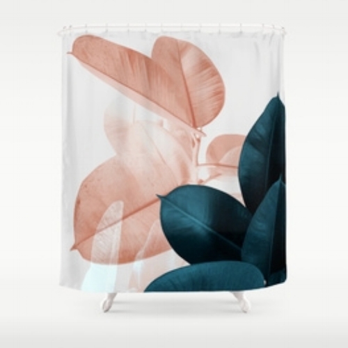
2. Blush and Blue Leaves Shower Curtain

From Society6 by PrintProject - $68.99

A shower curtain to swoon over. Blush pink leaves contrasted by teal blue leaves. Perfect for those who don't like anything "too floral." It's not exactly floral...its botanical!

40723009_066_b.jpeg


3.Ridged Terracota Pot

From Anthropologie - $12.00 –$34.00

You can actually just put a real plant in your bathroom, because well...hmmm... let's see (1) it's one of the most simple options, (2) real plants will always be one of my top decor items because it is so refreshing and (3) some plant pots are just so darn cute! Alternatively, you can arrange some of your favourite flowers in a vase.

Tip: Go for fake flowers and plants if you don't like the upkeep


2120.jpg


4.PINK TULIPE NO2 POSTER

From Desenio

Desenio is one of my favourite places to get affordable and eye catching prints. Check out their botanical prints and you'll surely fall in love with at least one poster. 


Untitled.001.jpeg


5.JAZZ MIX Tile (6" X 5.7")

From TilesInspired - $26.99 per sq. ft. | $145.21 per box 

These ceramic scallop or fish scale tiles, whatever you want to call them is the perfect love child of nautical and botanical design. The box comes with a mix of decorative patterns that is sure to be a showstopper.


Well, thats five! There's probably a million more ideas, but I'm not here to drown you in those ideas. Will you be sprucing up your bathroom decor for spring? If you are let us know what you're doing in the comments, we always love to hear your doing

6 BathRoom Trend Predictions for 2018

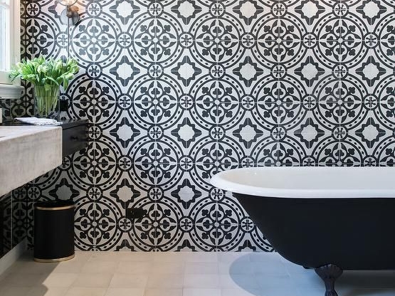
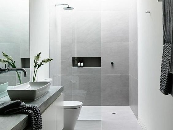
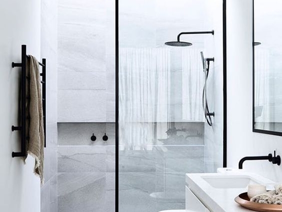
We wanted to do a quick roundup of some bathroom trends we are predicting to see pop up everywhere this year. Although you shouldn't just design your bathroom according to the latest trends, we still like to look at what is hip in the world of design and gather inspiration for each individual bathroom project.